State of the Chain #1
Catching Up With Stacks & Bitcoin

Hello and welcome to State of the Chain, a fresh newsletter reporting on trends and developments in the Stacks ecosystem as seen through the lens of Stacks on Chain, the data analytics platform for Stacks and Bitcoin. This initial edition will serve as an introduction and showcase of what’s possible with this uniquely powerful platform.
So what is Stacks on Chain, and why should you care? If you’ve ever used Dune, Defillama, or Dexscreener for analytics on other networks you’ll know how valuable on-chain analysis can be. Stacks on Chain decodes data from Stacks and Bitcoin nodes in combination with relevant off-chain information like USD price data and makes it all readily accessible with SQL-style queries and an intuitive visual interface. Dashboards can be created by anyone to mix and match related queries in order to paint a detailed portrait of any particular subject of interest.
Let’s take a look at some of the key features of the platform along with some of the most comprehensive dashboards being created. We’ll also give a quick primer on how to create your own queries, charts, and dashboards. Links to relevant pages are provided in the body text and section headers below.
Core Features
We’ll begin with an overview of some of the core features and analytics demonstrating some of the most useful insights available.
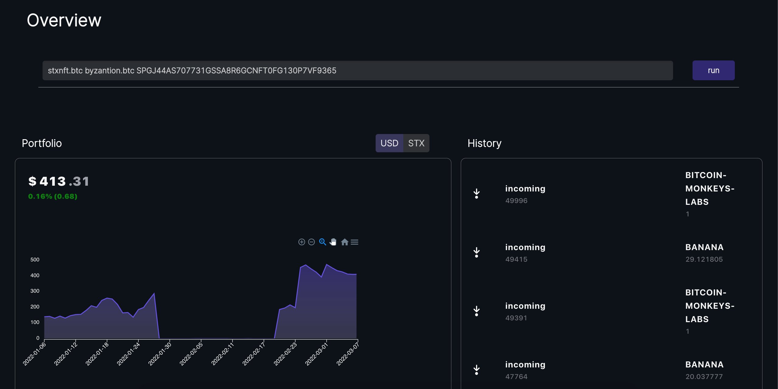
Portfolio
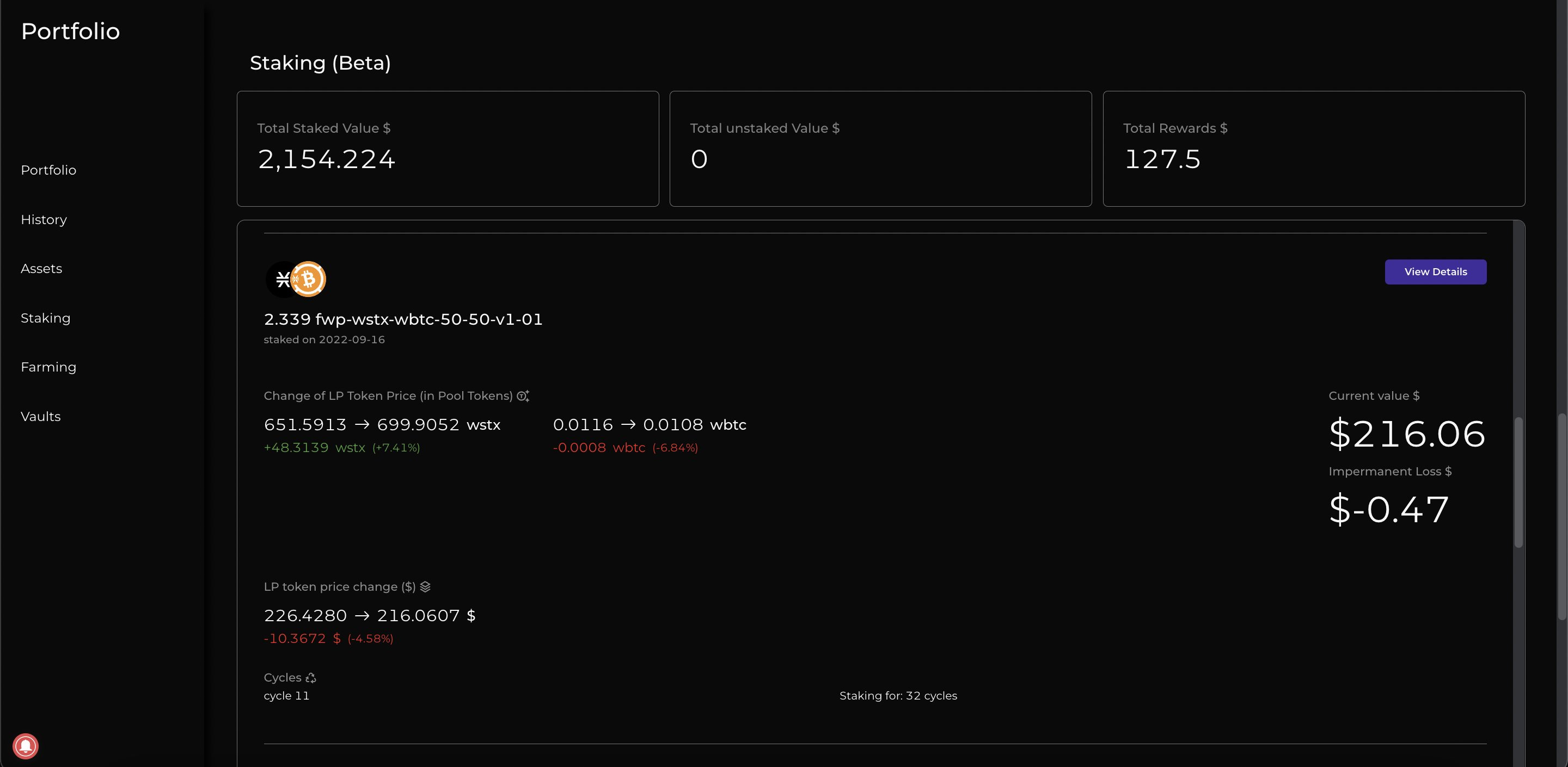
The portfolio page is an experimental dashboard that enables anyone to track their STX, NFT, and DeFi portfolio on Stacks. It’s a great feature for any active user on the network.
DeFi portfolio tracking currently supports Arkadiko vaults as well as ALEX farms, most recently including the calculation of unrealized impermanent loss.
NFT Alpha
Another impressive core feature is the NFT Alpha dashboard, which lets the user enter any NFT contract to generate a variety of useful charts related to rarity and prices over time.
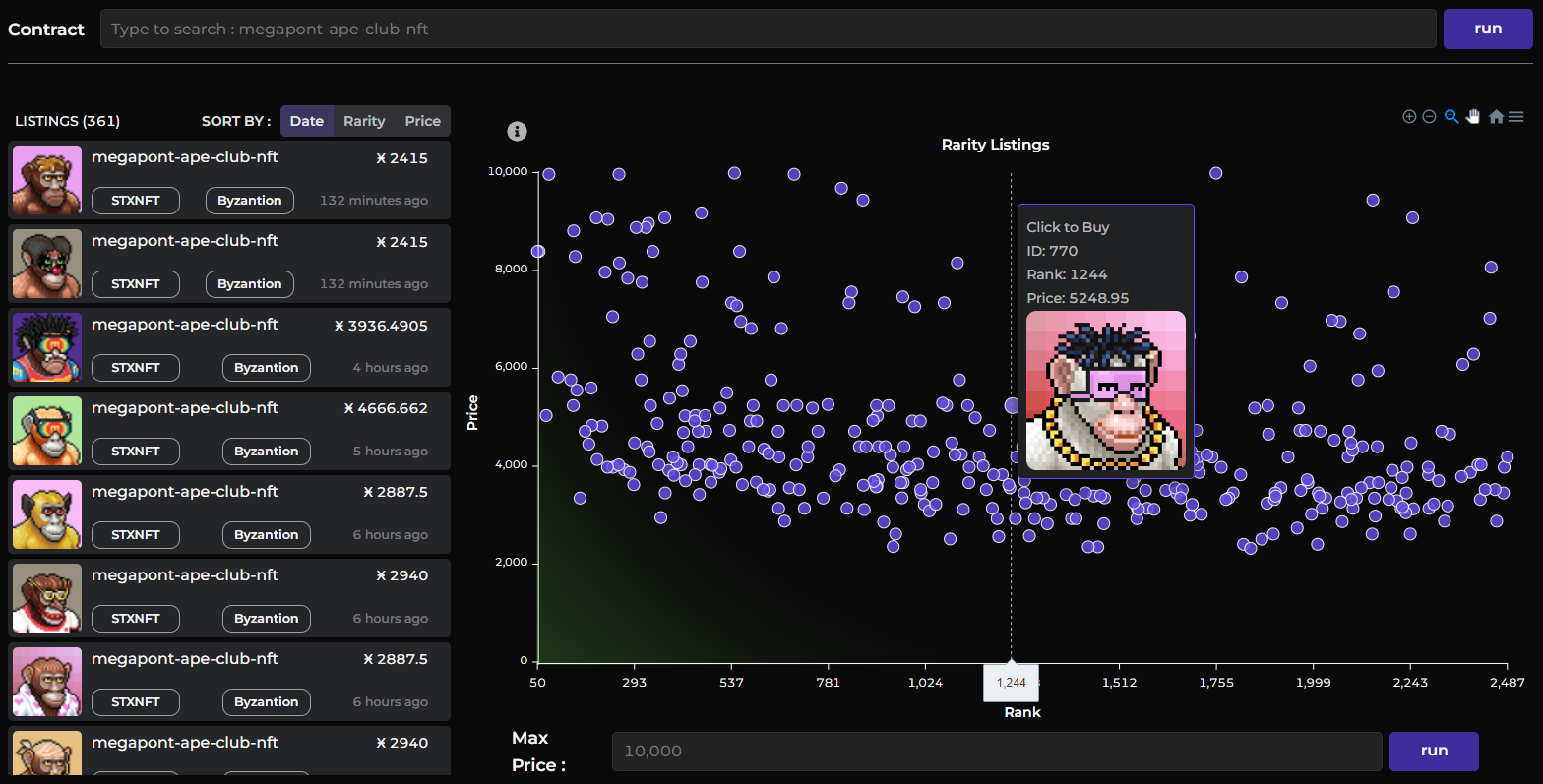
Another that I personally refer to frequently is the Discover Mints dashboard which shows the latest NFT mints by price and timeframe. More core dashboards are available from the homepage, the sidebar (hamburger menu), and the featured list on the dashboards page.
User Dashboards
User dashboards enable anyone to query the blockchain in order to discover alpha or tell a comprehensive story about on-chain activity. Here I’ll focus primarily on some of my own dashboards with particular relevance to recent trends in the ecosystem.
As a quick aside, note that when visiting user dashboards some queries can be rather heavy on performance and ultimately timeout, preventing the dashboard from loading altogether. In this case simply reload the page and let it continue running. Individual queries can also occasionally break when processing unexpected data, in which case the owner will need to update it and fix any errors encountered.
Dapp Catalog
Recently I went down the rabbit hole of hunting down lost and forgotten projects on Stacks, and did some private analytics out of my own curiosity. Then I ran across some frustratingly incomplete metrics going around in the community regarding the number of dapp users.


Having done the analysis myself, I knew this was obviously wrong. We can do better! So, after collecting all the information I had on various dapp contracts, I did just that.


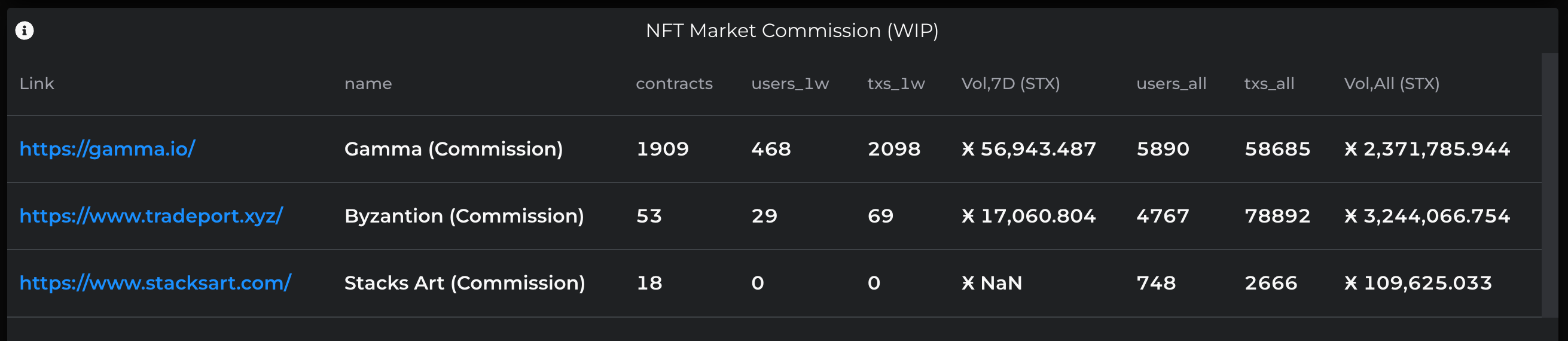
The Dapp Catalog shows an aggregate view of on-chain activity for known Dapps on Stacks. It demonstrated the reality of dapp usage and has since been updated with more dapps and information, including raw STX volume transacted.
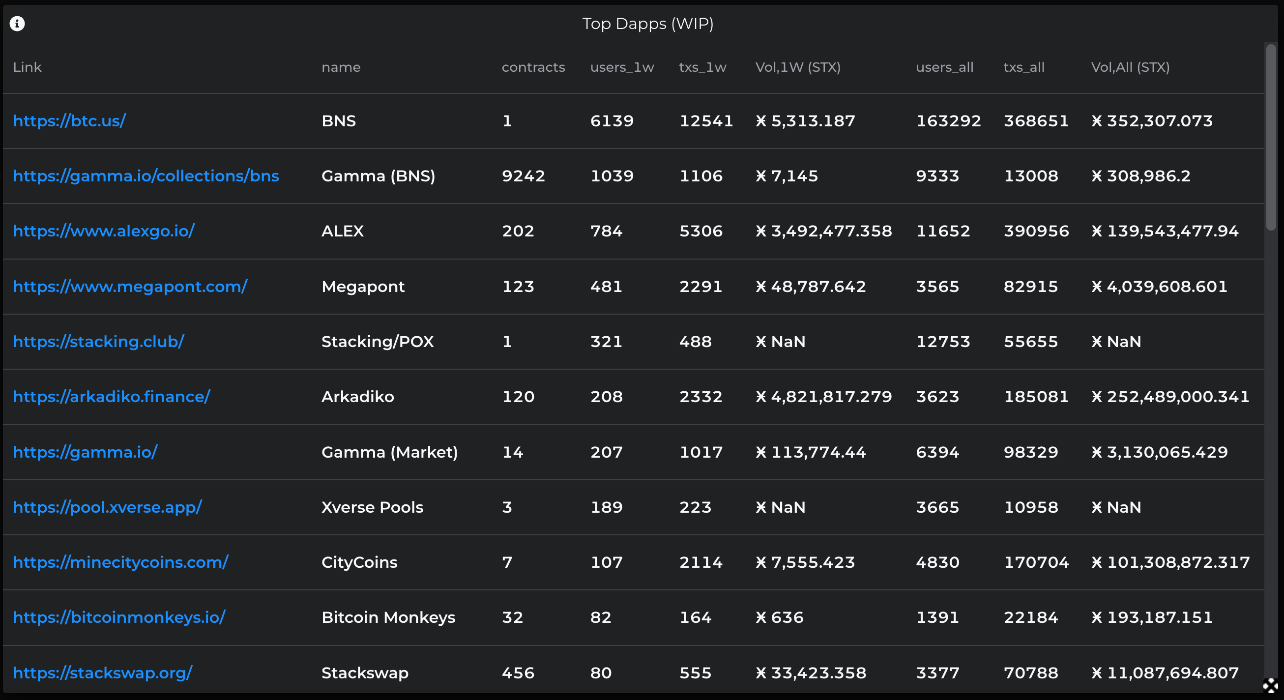
Of course, this is all measured on a “best effort” basis. Furthermore, some metrics are just too complex to fit neatly into the same monolithic query; for example, non-custodial NFT sales have a separate dedicated query.
Some lesser known dapps and contracts were difficult to find and keep track of, so I created another dashboard, Dapp Finder, to automate the process.
BNS Vision
BTC domains stirred up a new frenzy in September and October, sweeping up the vast majority of user activity on the Stacks network. It also brought in plenty of new users from the Ethereum space who were more familiar with the ETH names of the Ethereum Name Service (ENS) and the fantastic analytics on ENS.Vision. Some expressed an eagerness for a similar sort of “BNS Vision” for BTC names so I just had to go and create it myself.
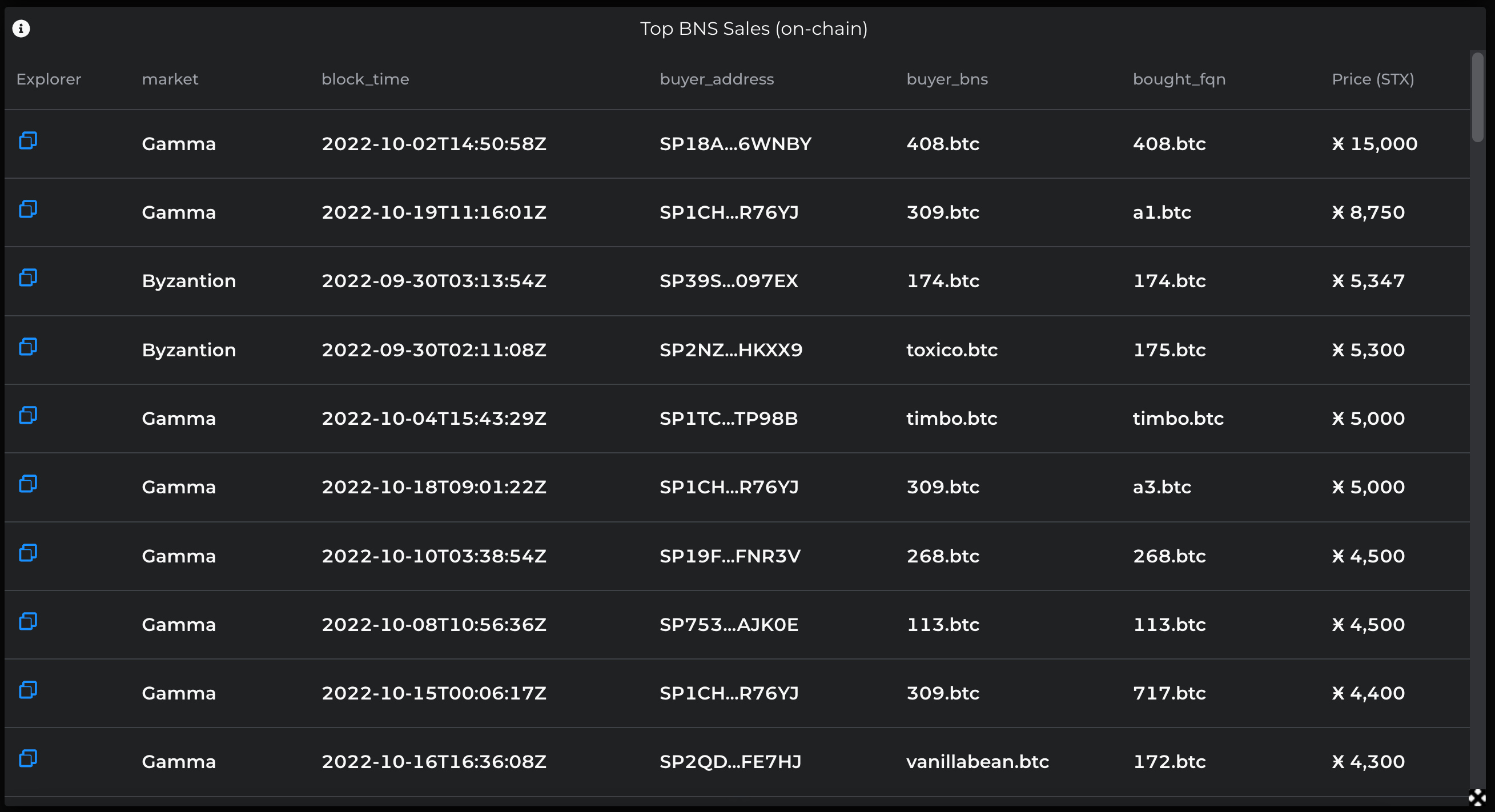
The analytics made it crystal clear: with new users came new all-time high sales prices and volumes.
Furthermore, various “clubs” formed around categories of names which led to some surprisingly large categories completely minting out of all stock.
All 10,000 4-digit BTC names were registered within a matter of weeks, while all 1,000 3-digit names had already been registered in months past.
All 17,572 3-letter BTC names were registered over the course of roughly one month.
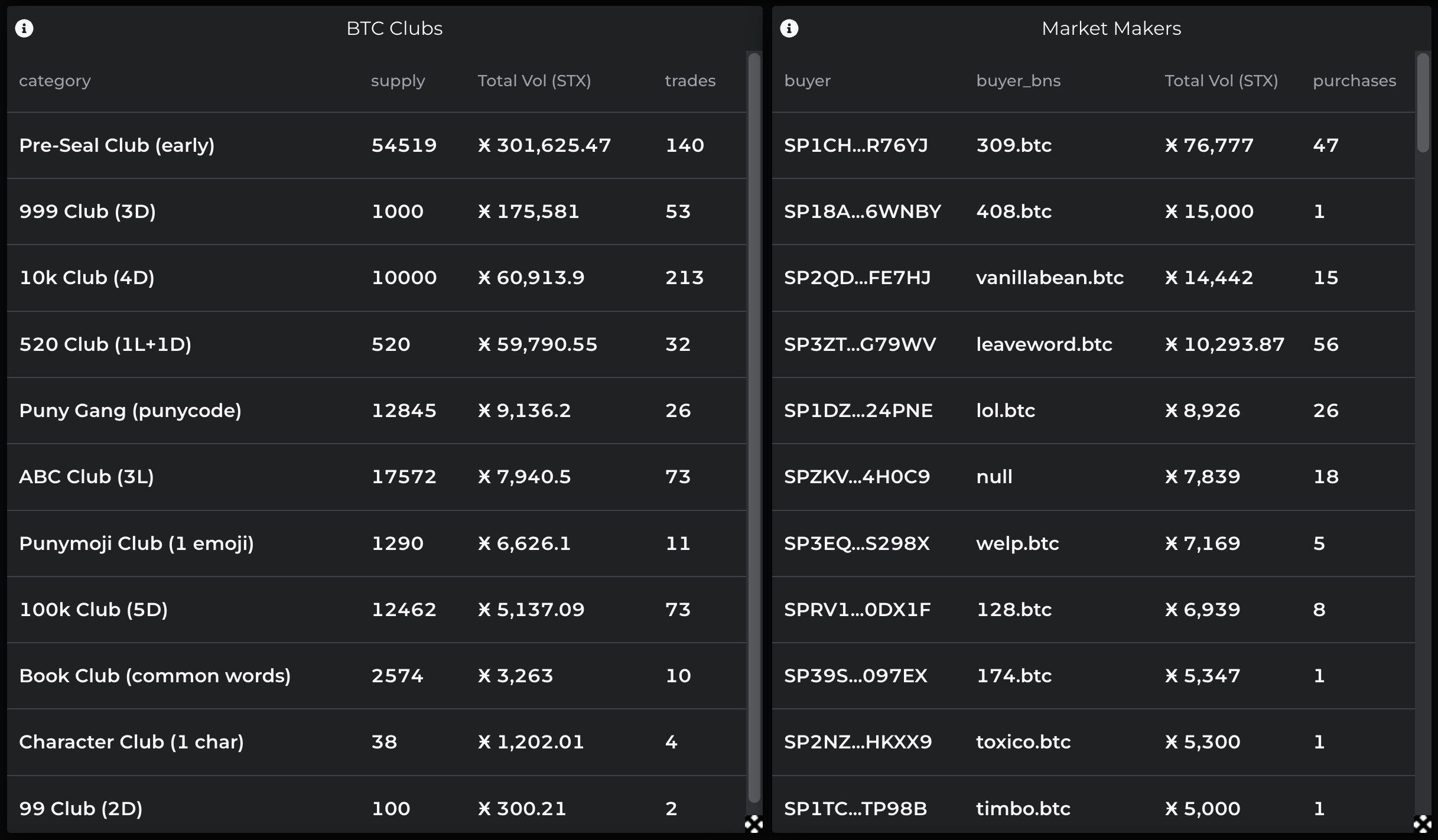
More than 10,000 punycode names were registered as users caught on to the clever workaround for the limited character set of BNS, culminating in their integration on Gamma and Hiro wallet. Stacks on Chain also now provides functions to encode and decode these names.


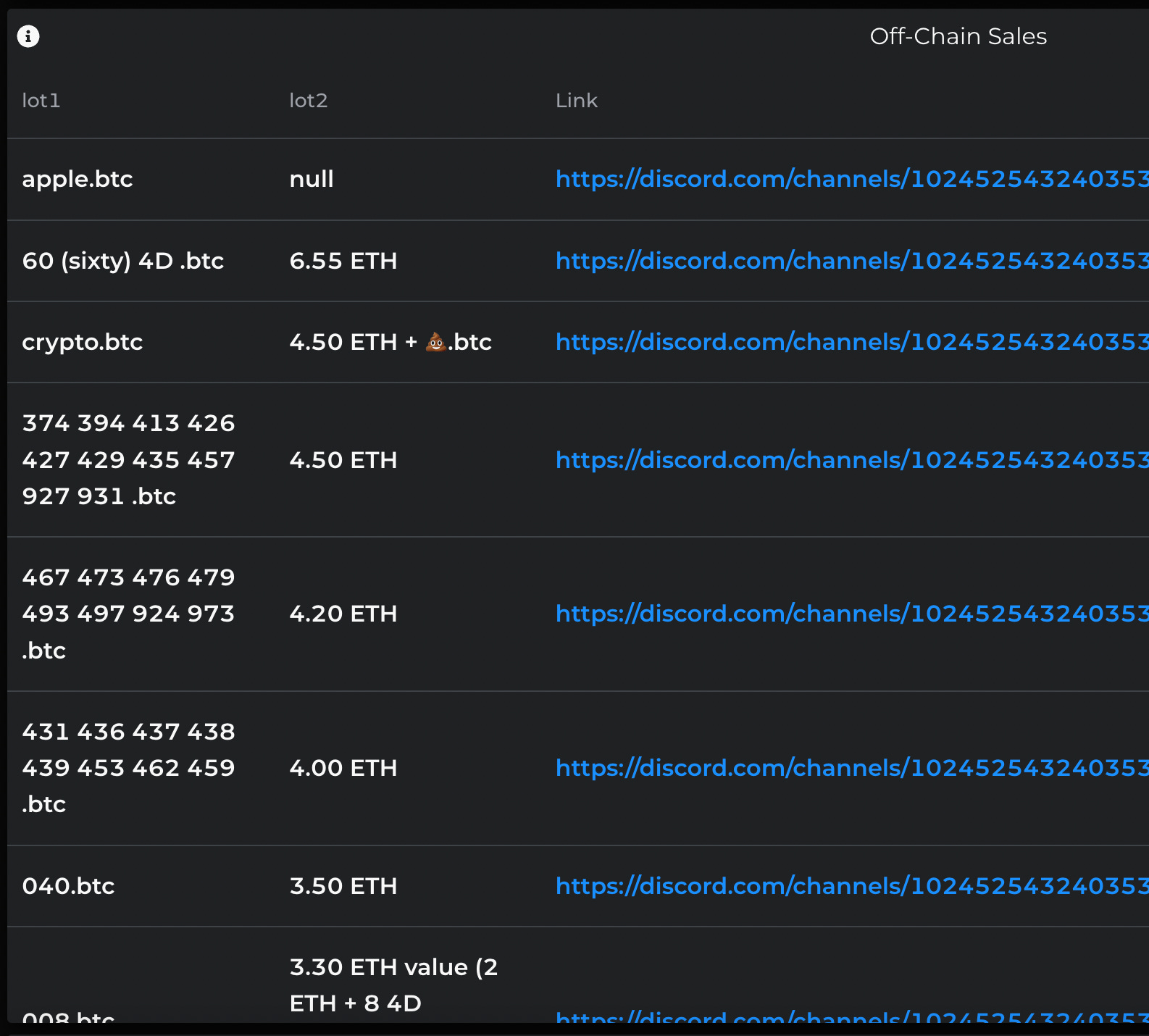
While Gamma had rapidly deployed a new BNS marketplace to accommodate the growing interest, surprisingly most of the top BNS sales actually happened off-chain via private escrow with ETH.
By the way, some users made particularly effective use of Stacks on Chain by creating dashboards for listing names still available to claim from the various clubs and categories.
Network Overview
This dashboard tracks off some of the most important network-level metrics, with some surprising stories to tell.
User Activity
For example, Stacks network activity can be broadly understood by looking at new and active user accounts along with STX fees paid and burned over time.
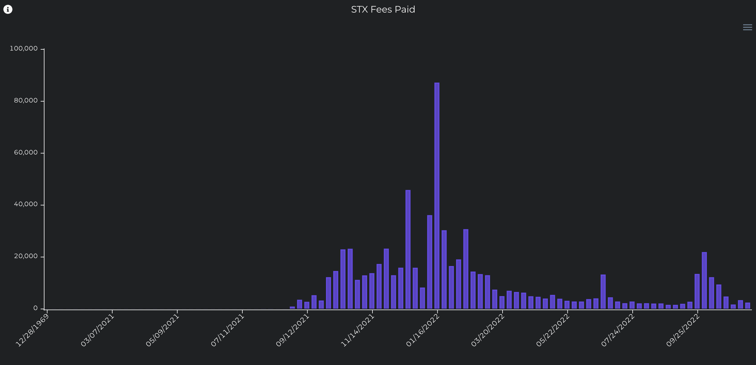
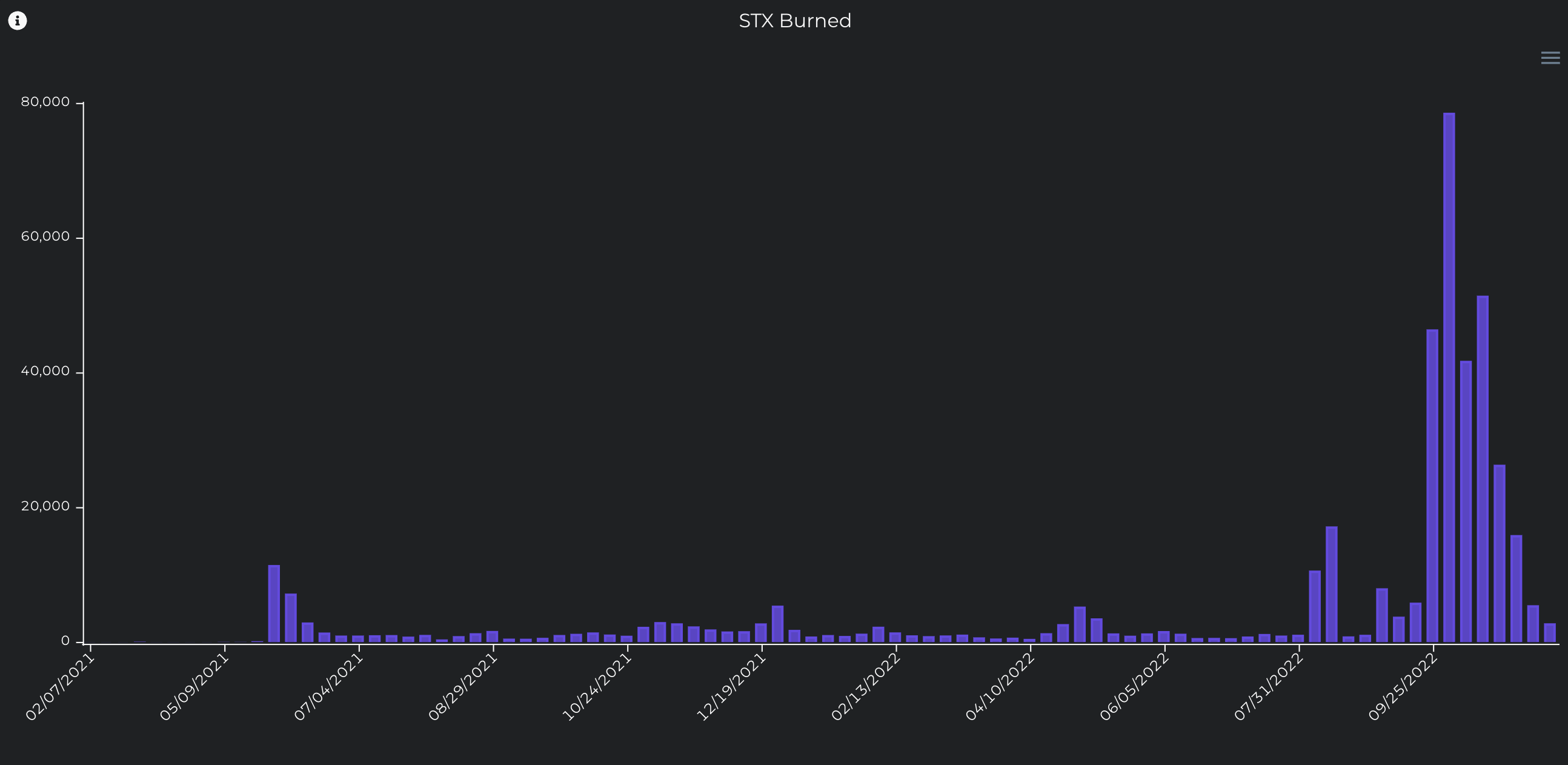
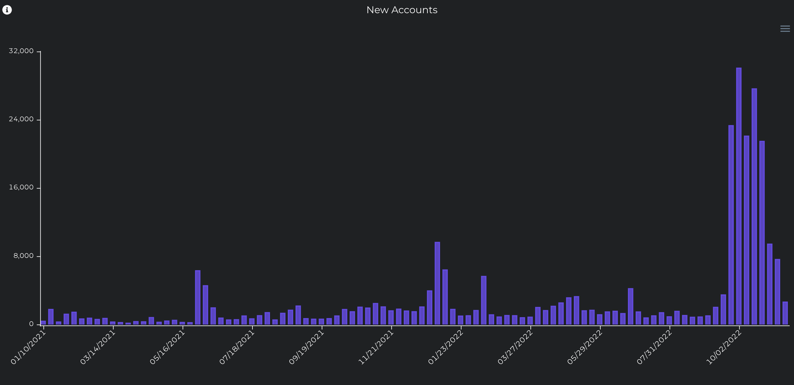
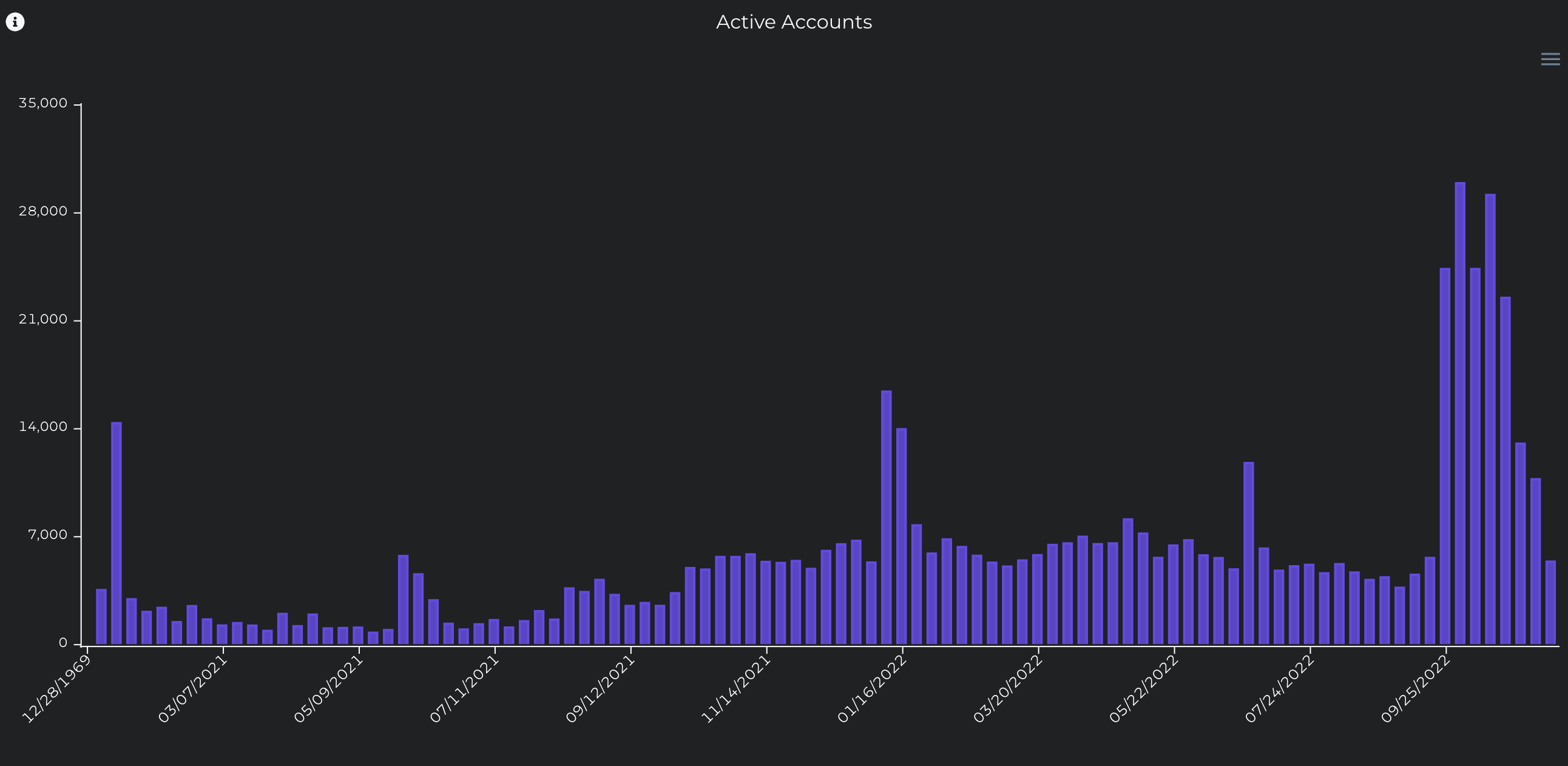
The enormous surge in recent BNS activity can be seen clearly in each of these charts, particularly in user accounts and STX burned because: (a) BNS only allows one name per address, so some users created hundreds of alternate accounts to register more; and (b) BNS fees are paid by burning STX, and it is one of the only ways that this typically happens.
Similarly, late 2021 and early 2022 saw immense growth with the launch of milestone dapps, including ALEX, Arkadiko, and Stackswap, as well as major NFT projects like Megapont and Bitcoin Monkeys.
Another dashboard worth mentioning here briefly is my Gas Fees & Mempool which was made to collect as much information as possible on recent transaction fees and network congestion. This one was particularly helpful during the BNS mania.
Block Times
Block times tell another fascinating story due to the relatively long (sometimes excruciatingly so) transaction times on Stacks and Bitcoin.
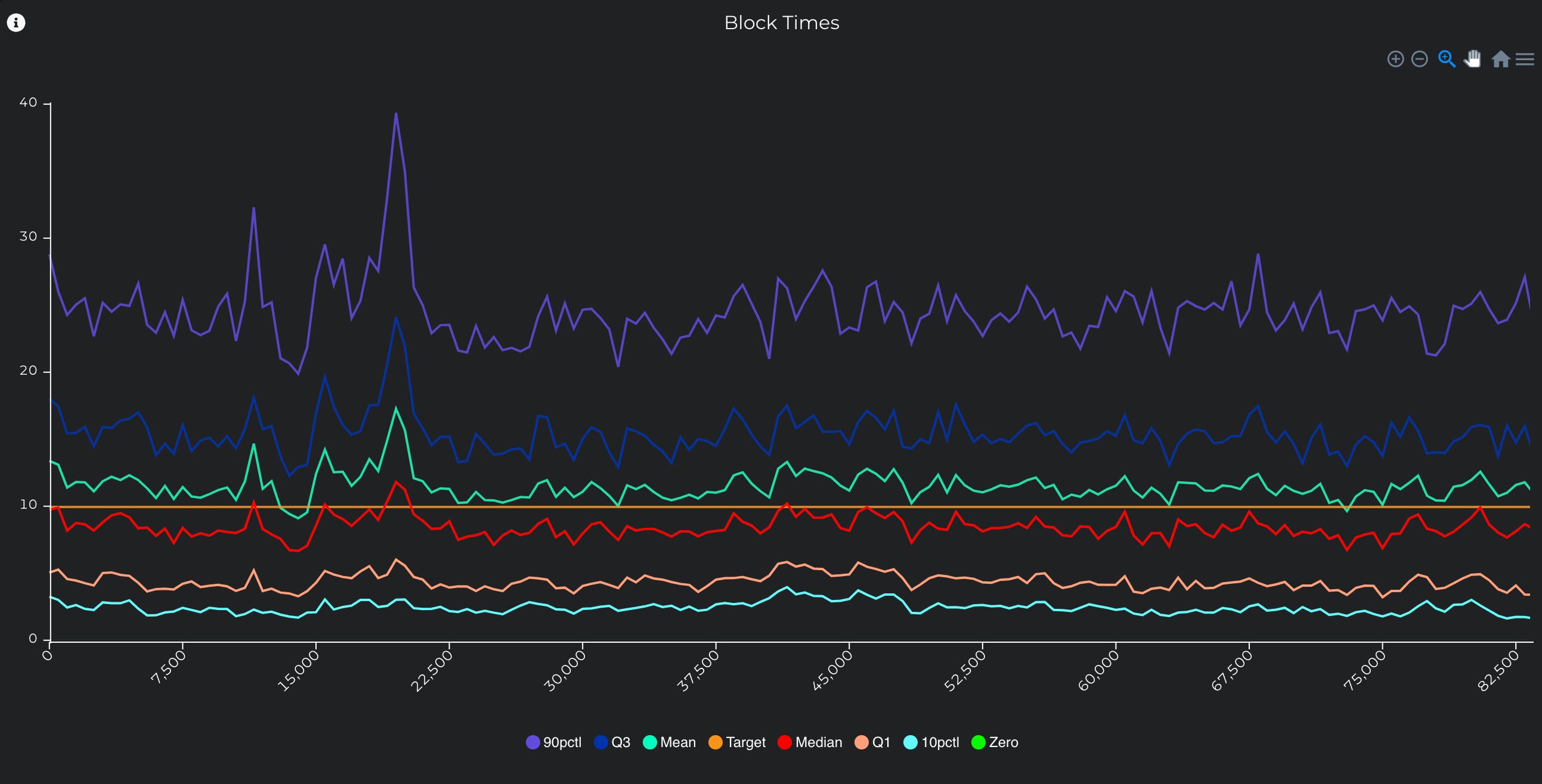
While the vast majority (90%) of block times are within roughly 25 minutes and half are within the Bitcoin target time of 10 minutes (as expected), the most extreme block times tend to go upwards of one hour.
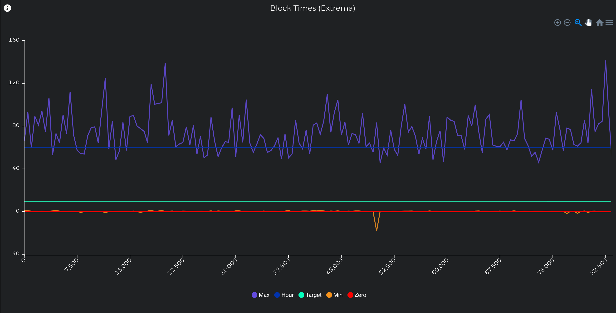
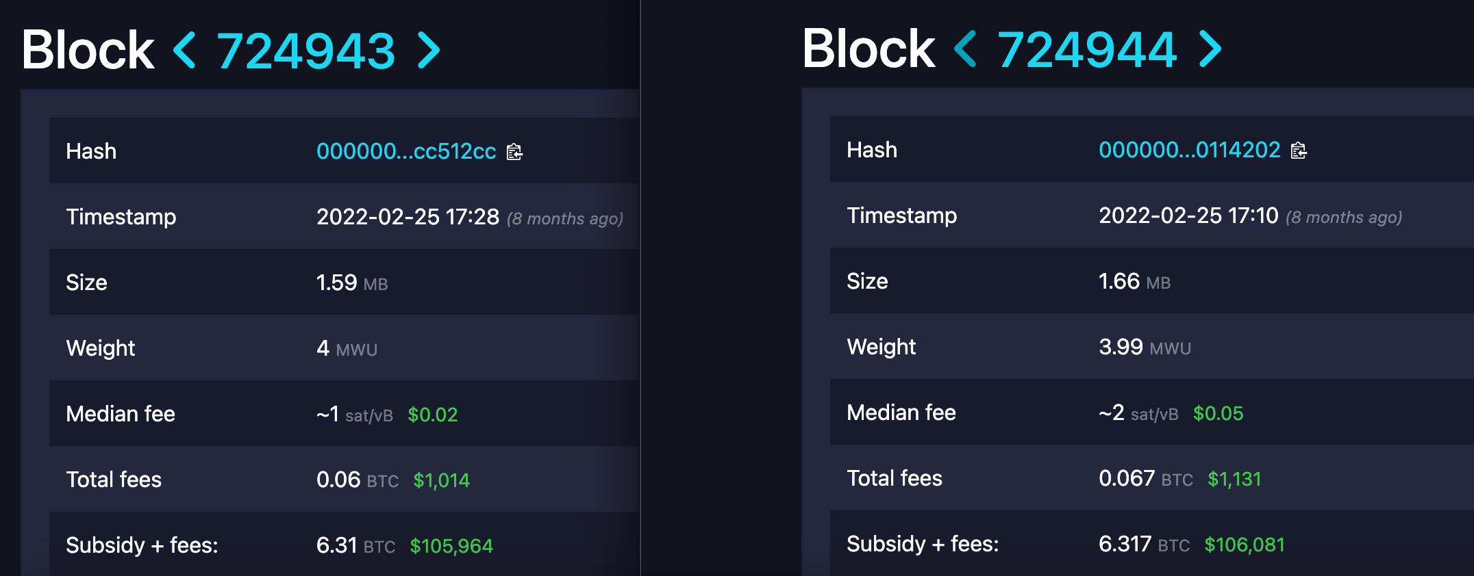
What is most surprising is that some blocks seem to have negative block times. These occasionally show up with a timestamp just slightly before that of the previous block, but in one case went back nearly 18 minutes. What is going on here? Surely this is some ridiculous bug or quirk of the Stacks network? Actually, no! This was Stacks block 50217 anchored to Bitcoin block 724944, and upon inspection we find that the negative block time was in fact on Bitcoin itself.
How can this be? It turns out that block timestamps are not strictly enforced so these anomalous negative block times can and do happen occasionally.
State of the Network
This is one of the oldest and most popular dashboards, and for good reason. It has a ton of handy charts and data, and it served as inspiration for the Network Overview dashboard.
Query: Getting Started
Users already familiar with SQL can get started running queries right away from the Queries page which also conveniently links to the Documentation to help reference the various tables and functions available.
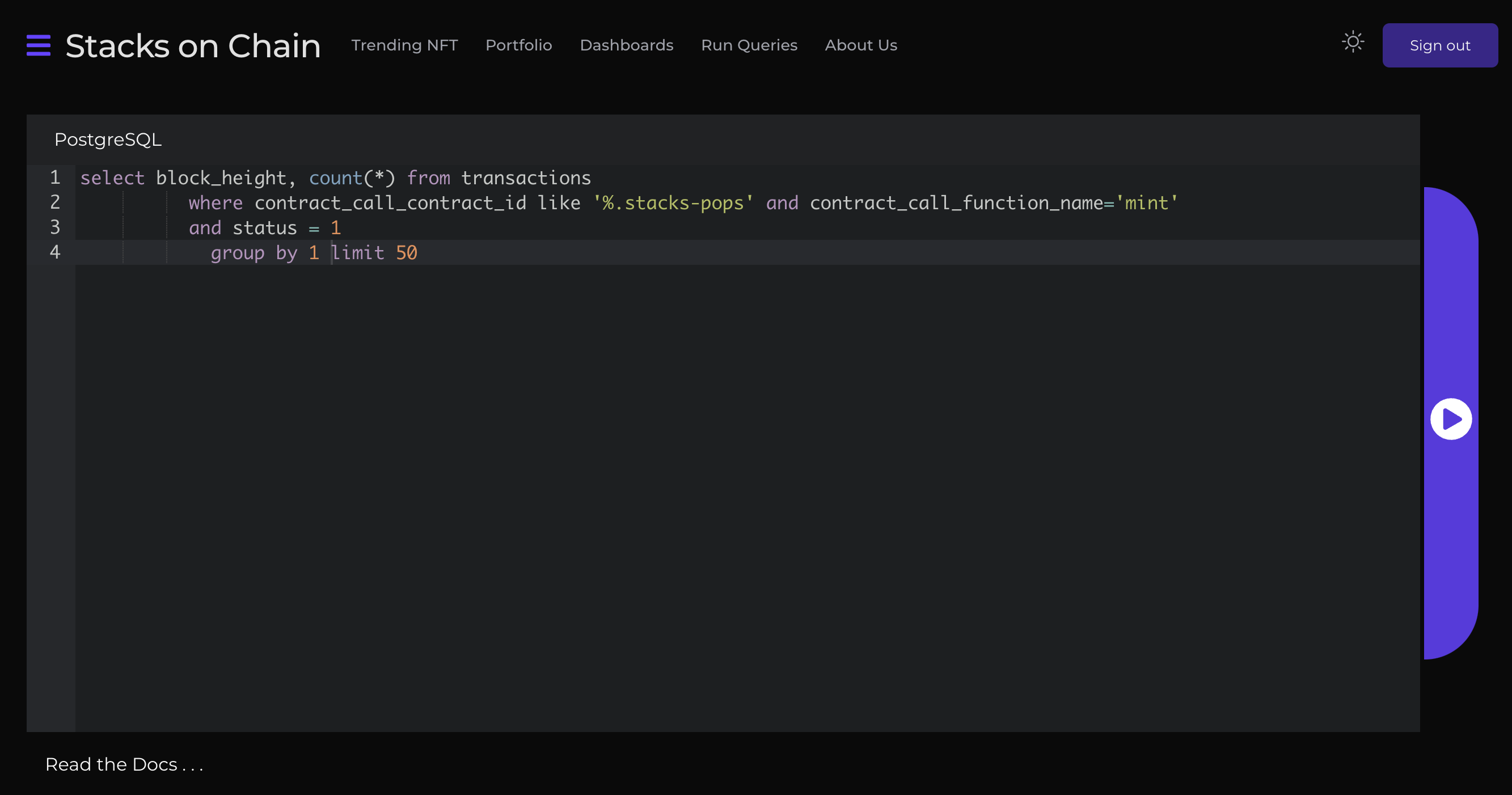
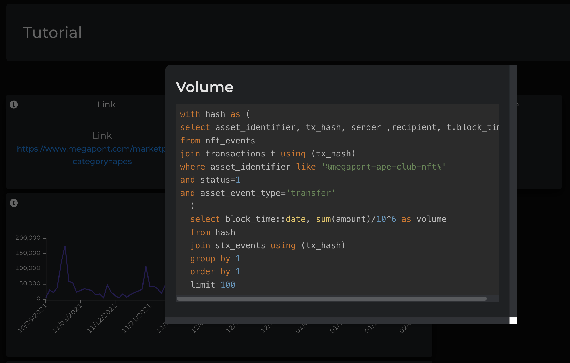
For those new to SQL, Stacks on Chain makes it easy to learn by example. Find a user dashboard that does something of interest, and press the ⓘ on the top left corner of a panel to show the full query used.
Then select and copy the query, head over to the query page, paste over the default query, modify as desired, and press the ▶️ button on the right hand side of the input form. Once the query is finished processing, scroll down to see the results shown below the query form.
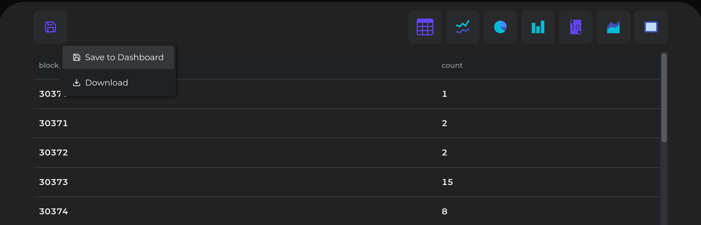
From here the visual presentation of the results can be changed as needed from a simple table to other options like histogram or pie chart, by pressing the buttons on the top right. Finally to save to a dashboard, press the save button on the top left corner and follow the prompts.
Closing Remarks
Data is at the beating heart of blockchain activity and can be both fascinating and powerful with the right perspective. Stacks on Chain aims to enable comprehensive access to these insights on Stacks and Bitcoin.
In future publications we’ll explore more of what’s possible with a look at additional dashboards, queries, and trends in on-chain activity. Stay tuned!
 |
|